Kokoro & Moi
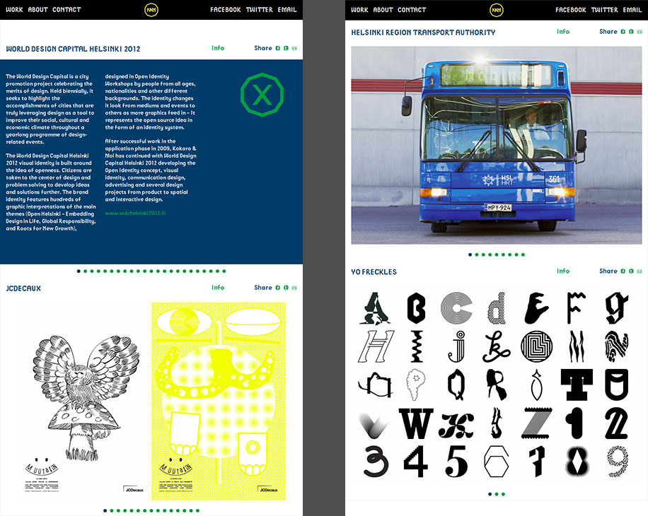
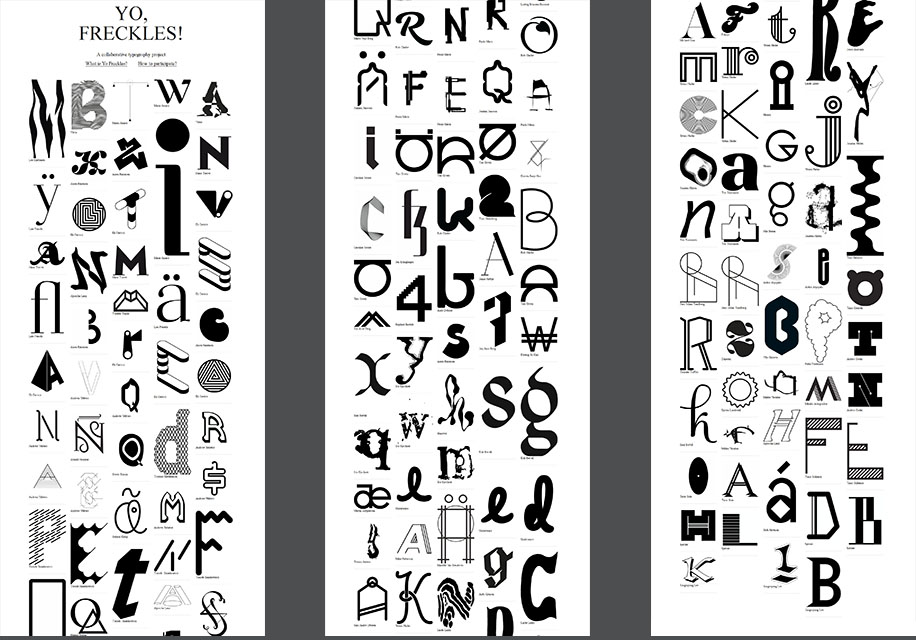
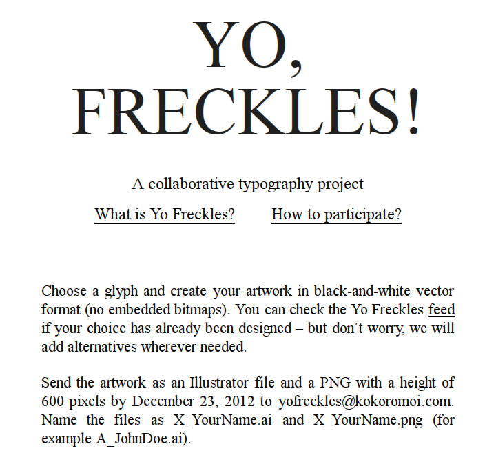
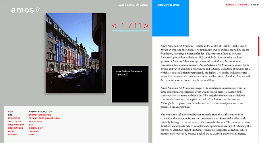
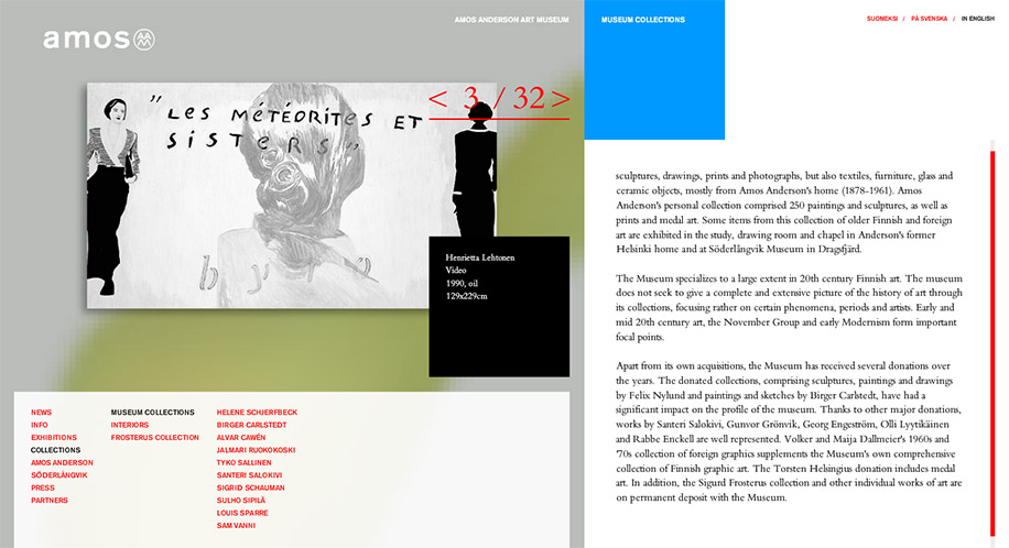
The user interface of Kokoro & Moi’s website was redesigned during the first months of WDC Helsinki 2012. The goal of the redesign was to enhance the usability of the website and make the user experience less clumsy by eliminating the need to navigate between different pages to view all the information. Another important objective was to minimize the amount of clicks needed to view the images of project showcases. A single page navigation was implemented to address these issues. In this type of setup more content is loaded into the page as it is requested by the user.


